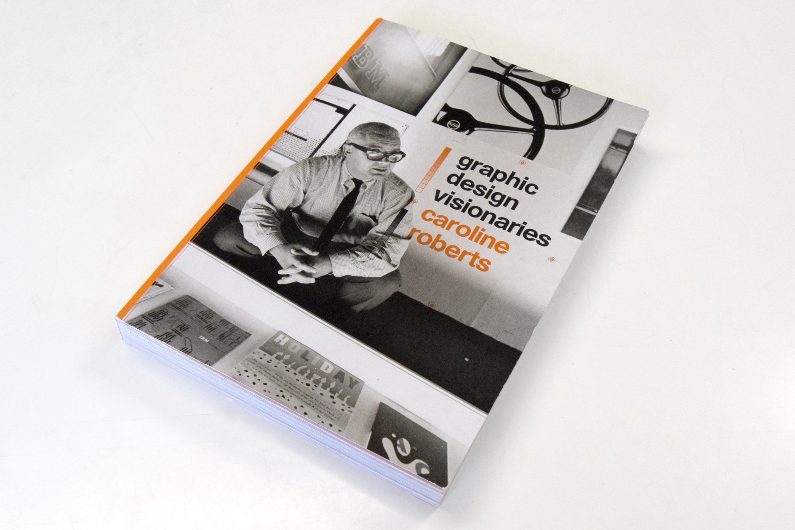
BOOK WEEK 1&2:
"GRAPHIC DESIGN VISIONARIES"
BY CAROLINE ROBERTS, 2015
The first part of my EXPANSION started with the book "Graphic Design Visionaries" by Caroline Roberts. Featuring 75 of the world's most influential designers, starting from the 19th century, this book presents the story of graphic design through the fascinating personal stories and significant works that have shaped the field. Arranged in chronological order, the book shows the development of design, from early innovators such as Edward McKnight Kauffer and Alexey Brodovitch to key figures of mid-century Swiss Design and corporate American branding. The book profiles masters of typography, such as Wim Crouwel; visionary magazine designers, such as Leo Lionni and Cipe Pineles; designers who influenced the world of film, such as Saul Bass and Robert Brownjohn; and the creators of iconic poster work, such as Armin Hofmann, Rogério Duarte, and Yusaku Kamekura. The exhaustiveness and size of the book, as well as the rich history, leading to contemporary artists and even studios, allowed me to lengthen its exploration to the second week of my plus plan, which was intended for contemporary graphic design. This allowed me to dive deeper into it, as 75 authors are a lot to grasp. Combining insightful text and key visual examples, this is a dynamic and richly illustrated guide to the individuals whose vision has defined the world of graphic design.
Reading and exploring through the book brought me back to its roots in the commercial art of the early twentieth century in the printing and book trades. Graphic design has undergone massive changes in the past 30 years, the graphic designer’s role has expanded hugely, and now encompasses that of art director, typographer, layout artist, photo retouched, and brand guardian, as the author points out. What caught my attention at the very beginning of the book was one question that was raised: ‘Where are all the women?'. Roberts points out that graphic design has been a male-dominated profession for many years, and a quick flick through the book reveals a very narrow demographic. So I approached this book critically but also with the aim to be inspired and most importantly: EXPANSION of my knowledge and views.
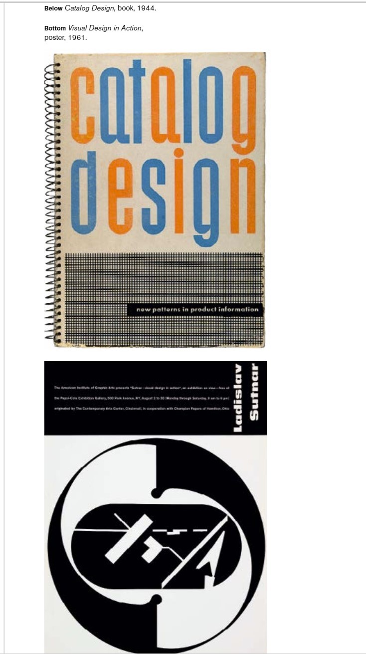
The first unknown artist that caught my attention had the name Ladislav Sutnar. It was because of his name at first, as it is a Slavic name, which is close to the culture I come from. He was an information designer from the Czech republic born at the end of the 19th century. I was also impressed by the quote by him, that stood at the beginning of his chapter: ‘Good visual design is serious in purpose. To inspire improvement and progress demands that the designer performs to the fullest limits of his ability. The designer must think first, work later.’ This last sentence made me think about if that is truly valid and how design views and approaches always vary from person to person. As I think sometimes it is important for a designer to start and experiment without expectations and with no thought or particular aim at first, as that playful way works as an individual and personal method of brainstorming with your own self. That is something of course, that I've grown to learn as in the beginning I was always focused on the end result, and I always wanted to have it in my mind before I start working. Things in the process always change though, so I learnt to start with careful research and sketching/experimenting especially if I don't know where to start. His work is distinctive with its strict lines and grids where no line is put anywhere unintentionally. He also works with really abstract shapes that are fascinating to be seen and recognized as the object they represent.
Another designer that I found as an interesting figure was Erik Nitsche. He is a designer from Switzerland that had a 60-year career. His name is not well-known probably not because of its quality but of his modest deposition. While his work contains 'a nod towards Modernism', as the author says, it is much less dogmatic and more expressive. The quote from him was again something that caught my attention: "I would hate to have to apologize for a design, to have people puzzle and ask, “What is it?”". Why I found this interesting is because I immediately thought of the designer Richard Niessen of whom I attended a lecture a few months ago, in which he stated that Graphic design should not take the illustrative role but make the viewer think, imagine and be critical. After thinking about the two I don't find this as an opposition between views, but more like disregarding the two extremities of an idea. What I mean is that they both speak of a balance between the abstract and the real that should exist in designing, which would not be literal and illustrative, making the people think, but at the same time making it possible for people to distinct objects and roles, allowing to make connections and reaching conclusions.
One other artist I was impressed by was Abram Games. The first work he was presented with was a thrilling graphic design work called "Men Leaping Ahead in Industry Read the Financial Times Every Day", created in 1955. I was struck by the amazing graphics, mixed with an illustration that is abstract, connecting two things in one image, but conveying its meaning so smoothly and fabulously. His name, as mentioned in the book, is rarely mentioned without his well-known mantra ‘Maximum meaning, minimum means’. That sentence I found a bit ambiguous but still valid - what he meant was that a poster should contain as much information as possible in the most economical way. What Games was mostly recognized for were the posters he created during and for World War 2. Although he was denied the chance to fight on the front line, it could be argued that these forthright posters played an equally important role in fighting the war on the home front. The poster was seen as a powerful weapon in the war effort, a tool to inspire a feeling of shared responsibility in the fight for victory. Soldiers were encouraged to keep their feet clean, and ventilate ammunition, while the public were urged to grow their own food, knit socks and refrain from gossip.
An artist that thrilled me with his different and distinctive work was Yusaku Kamekura and the Japanese design. He is in fact described as one of the godfathers of Japanese design. Kamekura was educated at the Institute of New Architecture and Industrial Arts in Tokyo. Privately run by Renshichiro Kawakita, the curriculum was unusual as it was based on the teachings of the Bauhaus. That way Kamekura’s work was influenced from abroad and eventually he started creating works in which he effortlessly blended Eastern and Western sensibilities. That's also what I found really compelling about him - his ability to keep the traditional Japanese motifs and forms, but at the same time mixing them with a recognizable use of image and concept.
Typography is a huge part of graphic design and typographers are the designers with such attention to detail and amazing skills and visions of aesthetics. I myself was very keen on typography at the very start of my graphic design practice, especially the old-fashioned hand-written/drawn one. I found it even as a kind of therapy. That's one reason why the typographer Herb Lubalin caught my attention. His playful approach to designing with words and images, treating type as image (and vice versa) was the antithesis of the regimented approach of the Swiss School that had dominated graphic design in the post-war era. Lubalin spent the early part of his career in advertising as an art director, but it was for the editorial work that he became most famous. Avant-Garde, a more elaborate fiction- and reportage-based publication, with a square format was where Lubalin’s most expressive layouts to date were published. One of the key factors was his use of phototypesetting (exposing negatives of letterforms on to photographic paper); Lubalin was one of the first graphic designers to really explore the technique’s many possibilities. Herb Lubalin is associated with the name Avant-Garde, both for the typeface and the magazine masthead where it originated. I was thrilled by the way he used type and letters, transforming them into shapes and playing with all kinds of typographic elements. Disregarding any rules there is, he created masterpieces of a kind that can still serve as an example of amazing typography.
Otl Aicher was a name I discovered that I felt like I should have found sooner. He created one of the most admired identities in the history of graphic design and was often credited as the first designer to create printed ‘brand guidelines’, which amazed me. In 1966, Aicher received the commission to become design director of the 1972 Munich Olympics. His corporate identity was designed to work with architect Günther Behnisch’s radical stadium design, and to reflect the motto of the so-called ‘Happy Games’ Aicher chose a bright colour palette to reflect the surrounding countryside, adapted Coordt von Mannstein’s winning spiral logo design (‘Bright Sun’) and created the first ever Olympic mascot – the multicoloured dachshund, Waldi. He oversaw every piece of collateral, from the posters for individual sports to medals, badges, tickets, timetables, uniforms, and a raft of souvenirs, including crockery, umbrellas and inflatables. This meticulous attention to detail led to an accomplished (and flawless) identity project, which many would say has yet to be surpassed. Aicher also undertook many other significant projects, including the identities for Lufthansa, Munich Airport, TV channel ZDF and Dresdner Bank. Choosing the practice of branding and having a genuine interest in it, I believe this name will for sure stay in my database and be a future inspiration for my projects.
I've always deeply admired artists that have a strong point and preference and with their designs fight for causes that they strongly believe in. That's why Ken Garland caught my eye right from the quote at the beginning of his chapter: ‘Don’t be fooled into thinking you will have great power when you have become a graphic designer; your greatest power will always be through your ability (as a voter at the very least) to contribute to political change.’ Ken Garland is that all too rare thing – a designer with principles, who designs for causes he believes in, which in his case have included the Labour Party and the Campaign for Nuclear Disarmament. Garland’s work for political and social causes was carried out independently of his studio. In 1962 he designed a poster for the CND’s Easter march from Aldermaston to London. He was not paid for the work, but describes CND’s organizing secretary Peggy Duff as his ‘most inspiring and endearing client’. When speaking about his design work, I was impressed by the feeling of perspective and 3d in the abstract and 2d shapes and simplistic approach.
Responsible for creating its much copied ‘I New York’ logo – still used to promote the city today was created by Milton Glaser in 1977. He designed a huge number of posters, publications, identities and interiors for a range of high-profile clients. Publishing was an area close to Glaser’s heart, and in 1968 he co-founded New York magazine with Clay Felker, which he art-directed until 1977. In 1976 Glaser was asked to work on a campaign to encourage tourism in New York State with the agency Wells Rich Greene. On the verge of bankruptcy, and with rising levels of crime, the city had reached its lowest point. The agency had come up with a slogan, but it was Glaser’s masterful graphic interpretation that cemented the phrase into the American psyche. Rather appropriately designed in the back of a New York taxi, it is thought that Glaser’s substitution of a heart for the word ‘love’ inspired the inclusion of this symbol as a special character in most modern typefaces. The logo was a huge success, embraced by New Yorkers and copied the world over. Having visited New York City a couple of times myself and being fascinated by it, it was really interesting to hear that story and know more about the designer himself.
Shigeo Fukuda's work stroke me at first with the image of a skull, created of small weird shapes that looked like baseball bats. His quote was: ‘I believe that in design 30 per cent dignity, 20 per cent beauty and 50 per cent absurdity are necessary.’ And I thought that was a really strong message. Despite being heavily influenced by the Swiss school of graphic design, Fukuda was renowned for his playful approach to both his life and his work – perhaps something inherited from his parents, who were both toy makers. His 1999 exhibition at the Asian Art Museum in San Francisco bore the title of ‘Visual Prankster: Shigeo Fukuda’. The absurdity he talked about in his work I thought was really unique and distinctive. However, his obvious sense of fun did not prevent him from tackling serious subjects through the many posters that he designed. His most famous, Victory 1945, shows a bullet being fired back towards the barrel of a canon. Its simplicity of line summed up the senselessness of war in a way that anyone could understand.
Another amazing designer and typographer that I stumbled upon was Wolfgang Weingart. He had a view that type must not always be set flush left/ragged right, nor in only two type sizes, not in necessarily right-angle arrangements, nor printed in either black or red. "Typography must not be dry, tightly ordered or rigid. Type may be set centre axis, ragged left/ragged right, perhaps sometimes in chaos.". His approach pushes against conventions such as the grid but never dispenses with them entirely. This approach I found as something to look at and when looking at his work it at first looks chaotic, but then you realize every thing has its place in the chaos and a reason behind it. He used collages mixing typography, photography and other elements turning into one-of-a-kind works.
They were often described as one of America’s most influential graphic design partnerships - Ivan Chermayeff and Tom Geismar are widely credited with revolutionizing the world of corporate identity. Their 300-plus identities for clients such as Chase Manhattan, Xerox and Pan Am form an unmistakable part of the post-war American graphic design landscape. As a designer with an ambition to work in the commercial field it was a great thing for me to read more about designers in the field who were one of the founders of this type of design. The studio continued to practice until 2005, when Chermayeff & Geismar set up a scaled-down studio after separating from their partners at the time, who included long-term associate Steff Geissbuhler. In 2006 there were three partners once again, when the founding pair were joined by designer Sagi Haviv. In 2013 the firm became Chermayeff & Geismar & Haviv. I was thrilled to find they created not only the logos but also the identities of companies such as NBC and Univision, which are huge names in their industries. And apart from that, the logos are amazing and a symbolic part of graphic design history.
I also found out about the work of Jonathan Barnbrook. Unusually for a graphic designer, he seamlessly combines typeface and graphic design with activism and social commentaryries. Despite maintaining a deliberately small set-up, Barnbrook is no stranger to large-scale projects. These have included the identity for Tokyo’s largest post-war development, Roppongi Hills. Other projects have included a Tokyo undertakers, advertisements for the British Heart Foundation, and identity for make-up brand Shiseido. One of Barnbrook’s most high-profile clients is David Bowie, with whom he has worked since his 2002 album, Heathen. Bowie was the subject of a sell-out exhibition at the V&A in 2013, and Barnbrook designed both the catalogue and the graphics for the exhibition. The same year he also designed the much-debated cover for Bowie’s album The Next Day, which (rather aptly given that his client is the master of reinvention) reworked the cover image of Bowie’s earlier “Heroes” album. What I found interesting about his work was the unusual use of shapes in combination either with photography or colors, which were at first a bit more difficult to grasp, with a deeper and hidden meaning, making the viewer curious to find out the meaning.
One of the most successful multidisciplinary design agencies ever, with clients spread across the world and 19 partners in five offices, I found out about Pentagram that still adheres to the principles on which it was founded in 1972. I saw their number of logos for different clients, each carrying its own complexity, simplicity, and meaning. Also, once again I was triggered by the quote, which stated: ‘Some of us are better at bringing in business, others at keeping clients happy, and others at winning awards... While we’re all paid equally, differences in profitability are often as much as three times. But we know that everyone’s playing an important part.’ I thought as a company with such practice was very important to realize how every person and every role plays a part in the realization of each project and they are all even and crucial. That is an inspiration to value more every person involved in the process, which I thought was a strong statement.
TO BE CONTINUED ....

Ladislav Sutnar
Erik Nitsche
Abram Games
Yusaku Kamekura
Herb Lubalin
Otl Aicher
Ken Garland
Milton Glaser
Shigeo Fukuda
Wolfgang Weingart
Chermayeff & Geismar & Haviv
Jonathan Barnbrook
Pentagram
START